6 Keys to Exterior Color
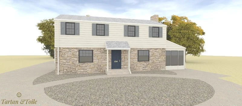
Above: 3D rendering for a recent client project.
With spring upon us, everyone is coming out of hibernation and the exterior part of our homes is becoming more of a focus again. Designers, despite the often used “interior” label, can offer a lot of color expertise on the outside too. So, before I head to High Point Market on Saturday, I wanted to share some insights on exterior home colors.
1. Match Clean and Dirty
As I have said in the past, one of the most important things to keep in mind with colors and especially with exterior colors, is to avoid mixing “dirty” and “clean” colors. When a home has a mixture of the two your eye only sees the “dirty” color and the house will not be a cohesive unit. “Clean” colors are brighter, more saturated or clear colors compared to a “dirty” color which is more muted, muddier or toned down in comparison. Here are two houses as examples. The one on the left has a clean pallet only. The house below mixes a pallet of both dirty and clean colors thus looks unfinished.
With interiors you can sometimes use other elements such as art, patterns, and so forth to distract the eye from a clean and dirty mishap.
The owner of the house above chose a very muted and “dirty” colored siding. Next to the bright white accents it doesn’t quite match. An alternative option for this house would have been to either choose and cleaner green color siding or a more muted white to even out the dirty clean colors on this house. A good way to make sure one color will not stick out more than another is to put the color swatches on top of one another. If one sticks out, it may be too clean compared to the other or vise verse. Here are a few more examples below of mishaps with clean and dirty mixing.
With this home the bottom half of the home looks dirty in comparison to the top and takes away from the aesthetic of the home.
This bright white would benefit from being dirtier or changing the siding to a cleaner color.
2. Pick Three Colors
Ideally a home exterior should have three colors, four at the absolute max. If you have more than three colors it can look too busy and fragmented. Many houses use just two colors. Adding an additional color for the door is a nice way to give the home character, however, in choosing the third color, make sure to be aware of the color pallete of the home. Also note that dark neutrals will age faster than light neutrals because neutrals usually go in trends.
3. Tie in Fixed Elements
When choosing your pallet for these three colors you have to take into account existing elements. These elements will dictate what colors you can chose and where you can go with your project. Stone, Brick, and Siding are examples of these “fixed elements.”
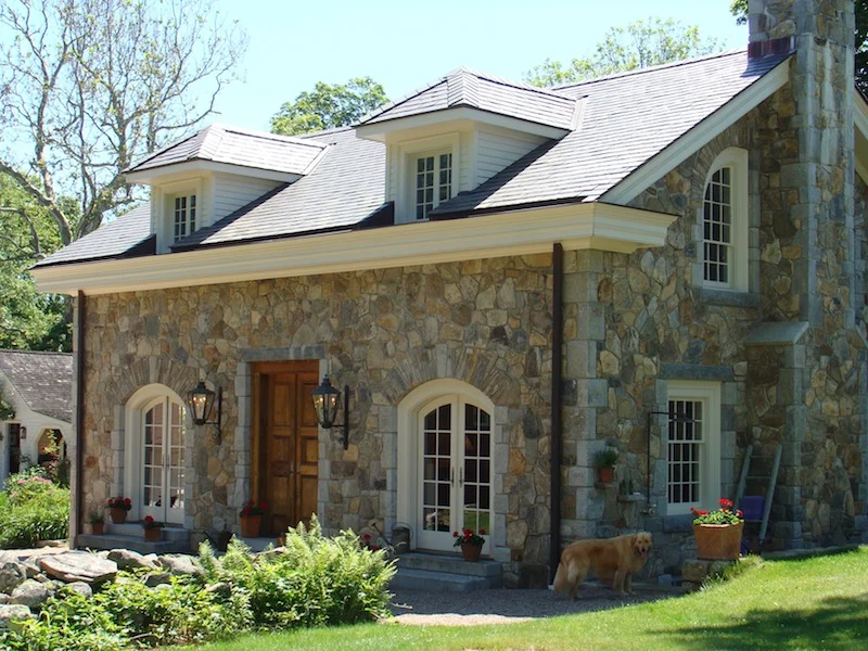
With fixed elements of stone you actually already have your color pallet. Whatever is in the stone combination becomes your color pallet—grey, taupe, pink beige, gold beige and so forth.
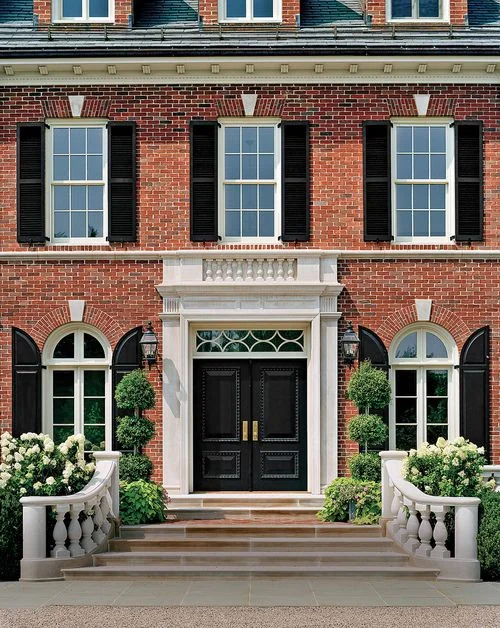
When choosing colors with a brick house you can also look to the mortar to guide you. A lot of times people will default to white or black accent and windows with a brick home. Depending on the type of brick it may actually be “dirty” and benefit from a softer color more than bright white. See some different bricks below:
A more muted “dirty” brick that works well with a cream trim. I would have chosen a cream with a little more grey so it would not be so yellow.
A more clean such as this picture shows works well with more clean elements of black and grey.
4. Trim is Usually White
Trim is a great way to give a home depth and create contrast. Most of the time trim for homes is white or cream. If you are doing the same color trim as the main home color you want to make sure that the trim is three shades darker, otherwise it will not give enough depth to the structure.
5. Match Your Downspouts
One hiccup I see alot with exteriors is that most homeowners leave their downspout extra white no matter what color or style their house is. Ideally downspouts should match the main color of the home in most cases. Some exceptions to this rule would be if you had copper downspouts or wanted to have them be a architectural player in the case of this home below. Gutters should match the window frames and fascia.
6. Test, Test, Test
It is important to note that when you paint stucco it will be darker than if you painted wood. So if you have a combo of stucco and wood on your home make sure to go a least a shade or two lighter on the stucco area of the home than the wood. Also, whenever you are painting a home make sure to TEST, TEST, TEST on the home. Try to pick an area that will have all the features of the home next to them. Light drastically changes the paint color from the sample. It can look 3 to 4 times brighter on the exterior than on a sample!
I hope you found this breif overview helpful. If you have any questions and want to talk exterior color, don’t hesitate to reach out!


